In the marketing and business communication space, printed materials still hold powerful sway. Whether it’s a vibrant flyer, an elegant business card, or a large-format banner, print remains a trusted medium for local businesses in Regina, Saskatchewan. However, the path from screen to paper isn’t always smooth. Design mistakes—often overlooked—can compromise print quality, drive up costs, or even result in missed deadlines.
At Davayo Advertising, a leading printing and advertising agency in Regina, we see these issues frequently. Here’s a breakdown of common design mistakes and how they can affect your printed projects—and more importantly, how to avoid them.
1. Ignoring Bleed Requirements
The Mistake:
One of the most common oversights is forgetting to add bleed to a design. Bleed refers to the extra space (usually 0.125” on each side) added around the artwork to ensure no unprinted edges appear when the paper is trimmed.
Why It Matters:
Without proper bleed, even the most precisely cut designs can show unwanted white borders. This becomes particularly noticeable on colored backgrounds or full-page graphics.
The Fix:
Always set up your design file with at least a 1/8-inch (0.125″) bleed. In Adobe InDesign or Illustrator, set bleed parameters at the document setup stage. Double-check export settings to include bleed before sending it to your printer.
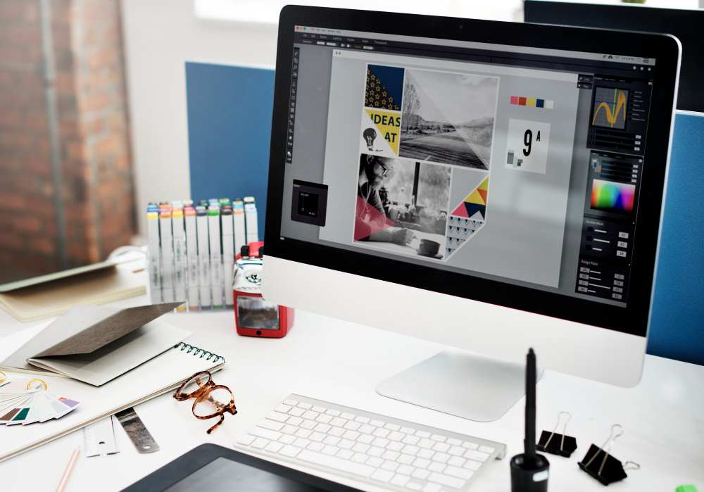
2. Using Low-Resolution Raster Graphics
The Mistake:
Designs meant for print often include raster images—JPEGs, PNGs, or TIFFs. Problems arise when these images are low resolution (less than 300 DPI) or pulled straight from the web.
Why It Matters:
Low-res images can look pixelated, blurry, or distorted in print, especially when enlarged. This diminishes the professionalism and impact of your piece.
The Fix:
Always use high-resolution images (300 DPI or higher) for print. If you’re unsure, zoom in to 100% or higher in your design software to check clarity. Consider using vector graphics where possible, as they scale without loss of quality.
3. Skipping Proofreading & Proofing
The Mistake:
A gorgeous design won’t matter if it’s riddled with typos, grammar issues, or incorrect contact information. Many businesses rush to print without thorough proofreading or requesting a physical proof.
Why It Matters:
Misspellings, wrong phone numbers, or outdated URLs not only waste money but can also damage credibility. Once it’s printed, fixing errors can mean a full reprint—costing time and resources.
The Fix:
Proof your work multiple times, ideally by more than one person. Always request a digital or physical proof from your printer before the full print run begins. At Davayo, we offer soft and hard proofs to ensure everything is accurate before hitting print.
4. Inconsistent Color Profiles
The Mistake:
Designers often work in RGB color mode—ideal for screens—rather than CMYK, which is the standard for print.
Why It Matters:
Colors in RGB mode may look bright and vibrant on screen but can appear dull or off when printed. CMYK colors, on the other hand, are calibrated for ink-based printing.
The Fix:
Always convert your files to CMYK before sending them to print. Use Pantone swatches when exact color matching is critical, especially for brand consistency.
5. Overlooking Margin and Safe Zones
The Mistake:
Placing text or important elements too close to the edge of the page without accounting for trim and safety margins.
Why It Matters:
Text or logos can get cut off during trimming. This can make the piece look unbalanced or even unreadable.
The Fix:
Keep all critical elements at least 0.25 inches inside the trim line. Most design software allows you to set safe zones as guides to keep everything in check.
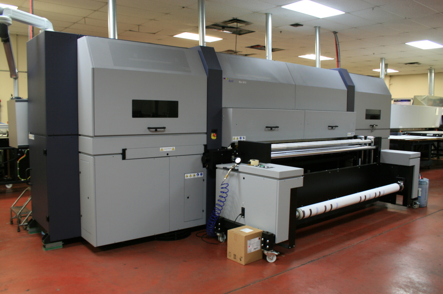
6. Sending the Wrong File Format
The Mistake:
Submitting design files in formats not suitable for professional printing—like Word docs, PowerPoint files, or flat JPEGs without bleeds or layers.
Why It Matters:
Incorrect formats can delay production, reduce quality, or lead to misinterpretation of your design.
The Fix:
Always ask your printer what file format they prefer. At Davayo, we recommend print-ready PDFs with embedded fonts, correct bleed settings, and CMYK color profiles.
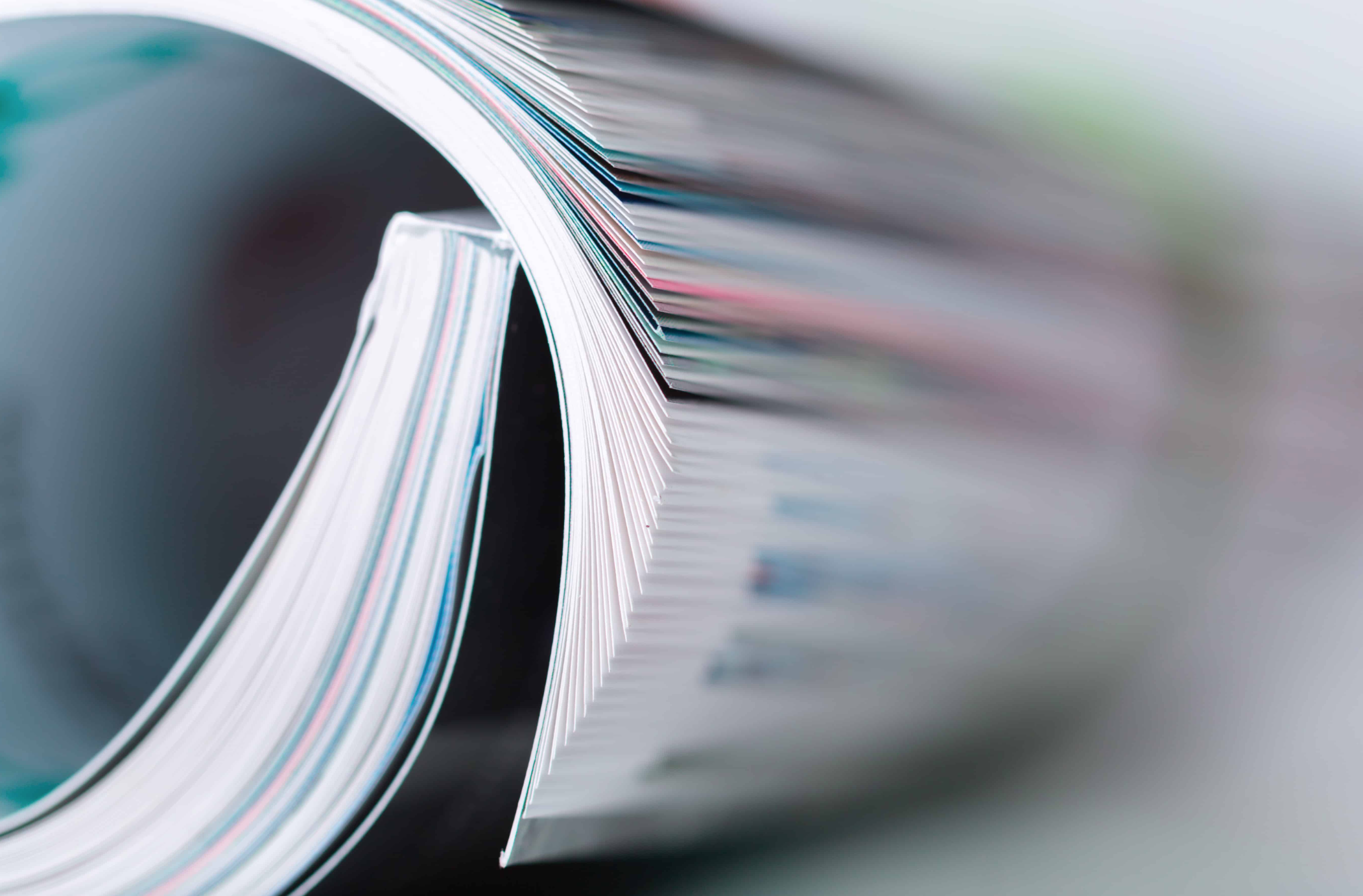
7. Not Understanding Paper & Finishing Options
The Mistake:
Designers may not consider how paper type, finish (matte, gloss, satin), or special effects (like Scodix, foil, embossing) will impact the final look.
Why It Matters:
Your design may look great digitally but may lose its charm—or function poorly—on the wrong stock or finish.
The Fix:
Consult your printer during the design phase. At Davayo, we offer expert guidance on paper types and specialty finishes to align your design with its intended feel and function.
Final Thoughts
In Regina’s competitive business landscape, print remains a powerful tool for branding, marketing, and communication. But great print starts with great design—and avoiding these common mistakes can save you time, money, and headaches.
Whether you’re printing brochures for a local campaign, business cards for a trade show, or menus for your restaurant, Davayo Advertising is here to help bring your vision to life—flawlessly.
Need help preparing your files for print?
Talk to our team today. We offer free pre-press checks and consultations to make sure your print job is perfect from the start.